STORY
A brand unearthed
Problem
For the branding of my design consultancy and publishing business, Aqualith Media, I needed imagery that required my work to stand on its own, to look natural, and have a hint of the fantastical.
Initial concept
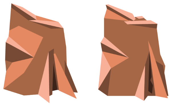
In my narrative, the Aqualith itself is a blend of a number of elements: water and earth, or to be more specific, a stone monolith with a geyser sprouting forth from its’ side. Monoliths are often depicted as tall slabs of rock, freestanding by themselves in their environment. The element of air plays an important role, providing a spatial, otherworldly, near-deafening calm as one approaches the structure.
To translate this into a shape that could be used in branding, the obvious choice was to start with a rectangle, but I initially envisioned it would either double for a lowercase letter ‘a’ or capital ‘Q’ if I decided to incorporate the name with the mark itself. This would influence the offset crevice for which water would pour forth from it.
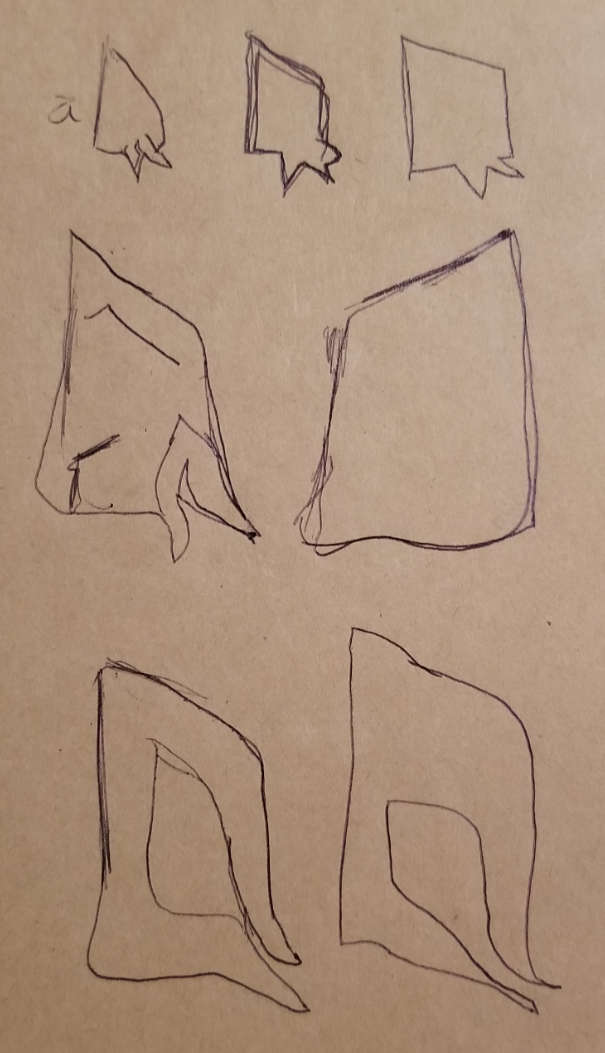
I was getting somewhere in these early shapes, but my flat sketch work was failing me. It quickly became apparent I needed to think beyond my usual comfort zone for this one.
Dimensional thinking
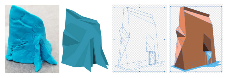
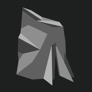
Thankfully, with a little one in the house, I had access to Play-Doh! This turned out to be an easy, tangible solution to convey what was in my head in three dimensions, to have a better look at the shape I was trying to convey. And I got to play with Play-Doh.
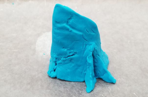
This allowed me to shape even what the backside of the figure could look like if needed. But the actionable front proved the most interesting; giving me plenty of insight to carry the idea back into Adobe Illustrator.
Initially, I retained the blue color of the Play-Doh I used due to it’s correspondence with water, but later found need to instead use a contrasting brown, tan, or copper. To my surprise and delight, this would continue forward to the final version.
Iterative disappointment
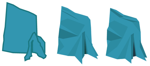
After wrestling with this design off and on for a time, I finally settled on a look I thought I was happy with. However, simplicity was something important to me, as I knew this icon would be decreased in size and used on social media, letterhead, and business cards. Reducing the size means that features could appear muddy, making it difficult to make out what the image is conveying, especially for something as abstract and imaginary as the Aqualith. While even the best of logos can still lose their exact agency when displayed in reduced scale, no matter how easy to read they can be, I noticed this specific one was indeed suffering, especially in gray-scale. It was time to simplify.
Arrival
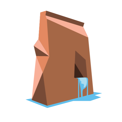
The final component of water itself would actually lead me to a more simplified solution. The heavy focus on the crevice was the main problem. I was directing the eye toward it with intentional angles and shading, but there ended up being too much focus on it. Pulling back and making a simplified, obvious hole for the water, allowed for the eye to interpret it more obviously and allowed it to produce a moat around the monolith.
The decision to include the water, further supported my overall concept while enhancing it with movement and life and allowing me to include an important contrasting color.
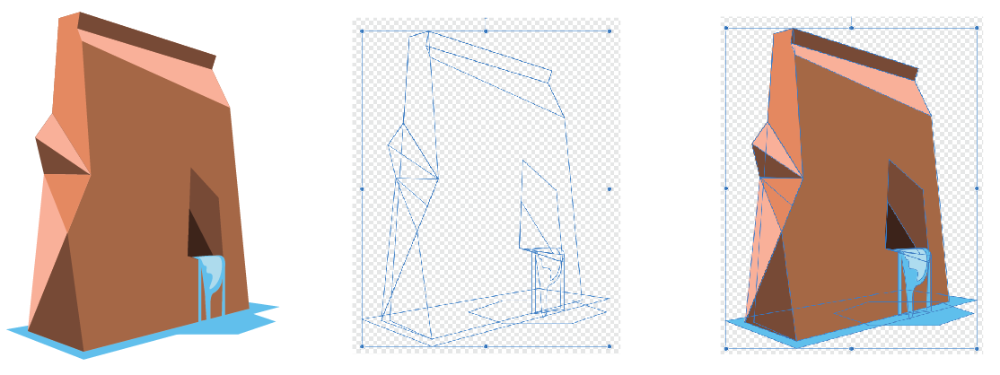
Upon further scale testing, I found that increasing the size of the crevice ever so slightly helped the design further, producing one of, if not the best logos I have ever produced.
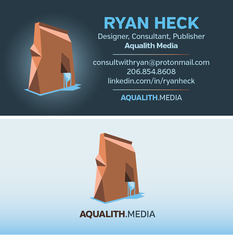
Shown above are both sides of my business card, measuring 1.75 x 3 inches.
Thank you for taking the time to read the story of how this logo came to be.